FAQ Can I customise the status page logo and design
It is not possible to simply customize updown.io status pages design or logo for the moment. You can find a couple suggestions here if you want to add your vote:
https://updown.io/features/custom-logo-for-public-status-pages
https://updown.io/features/custom-css-for-public-status-pagess
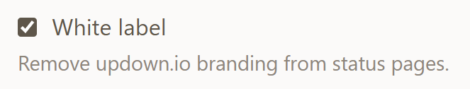
It is, however, possible to remove the updown.io logo using the White label option in your settings:
Also the description field of your multi-site status page can include markdown (including images), which can help you make it look like yours (e.g. showing your logo/brand/client logo).
Finally, it is always possible to use your read-only API key to build truly custom status page or dashboard in javascript if you need something different. Our API accepts CORS requests so you can built it in standalone javascript.
Here are some example custom status page made by our users that you could start from:
https://github.com/nya1/updown-status-page
https://github.com/Hexstream/status.abc.hexstream.xyz
https://github.com/SocialGouv/dashlord
https://github.com/MTES-MCT/updownio-action
You can also ask LLMs to build one for you, here is an example: https://status.dushan.org (hosted for free on Cloudflare Pages)
Claude prompt used to build this page
Build a lightweight, self-contained status page that fetches live monitoring
data from updown.io and displays it as a compact uptime dashboard. No backend
needed — pure HTML, CSS, and vanilla JS. A single index.html, a styles.css,
and a script.js.
Page setup
- Minimal, dark-themed single-page layout (dark background, light text)
- Centered container, max-width ~680px, responsive
- Page title and heading with the site/project name
- A row of links to related projects/sites
- A footer with privacy/contact info
- Favicon set (use RealFaviconGenerator to generate a full set: SVG, ICO, PNG 96x96, apple-touch-icon 180x180, web-app-manifest icons 192+512, and site.webmanifest — place them in an /icon/ subdirectory)
- Meta tags in
<head>:- charset, viewport
- meta description
- theme-color (matching the page background)
- Open Graph: og:title, og:description, og:type, og:url, og:image
- Twitter Card: twitter:card (summary_large_image), twitter:image
- Create a preview image (e.g. 1200x630px) for OG/Twitter sharing
Status section
API integration
Fetch the list of checks from: https://updown.io/api/checks?api-key=YOUR_READ_ONLY_KEY
Then fetch downtimes for each check in parallel from: https://updown.io/api/checks/{token}/downtimes?api-key=YOUR_READ_ONLY_KEY
Store the API key in a separate config.js file excluded from version control.
Status header
Show "All systems operational" (green) or "Some systems have issues" (amber)
based on whether any check has down: true.
Per-check rows
For each check, display:
- A colored dot (green = up, red = down)
- The check alias
- The uptime percentage (from the API response)
- A horizontal bar chart showing the last N days of uptime:
- Green = no downtime
- Amber = brief downtime (< 10 min)
- Red = significant downtime (>= 10 min)
Responsive day bars
Calculate how many day-bars fit based on container width (each bar ~22px
wide, minimum 7 days, maximum 90 days). Re-render on window resize
(debounced). Cache the API response so resizing doesn't trigger new fetches.
Day-bar calculation
For each day in the visible range, calculate total downtime seconds by
checking overlap between each downtime window (started_at / ended_at) and
the day's midnight-to-midnight range. Classify:
- 0 seconds = green
- > 0 but < 600 seconds = amber
- >= 600 seconds = red
If the check is currently down, override today's bar to red.
Bar legend
Show "{N} days ago" on the left and "Today" on the right below the bars.
Loading state
Show a shimmer placeholder (a few pulsing rectangular lines mimicking the
layout) while the API data loads. Once data arrives, replace the placeholder
with the real content and reveal it with a CSS zoom-in transition (scale
from ~0.92 to 1.0 with opacity fade-in, ~1.2s duration with a spring-like
cubic-bezier curve). Only animate the first render — skip the animation on
resize re-renders.
Security note
Use a read-only updown.io API key. Store it in a separate config file
(e.g. config.js) that you gitignore.
Constraints
No frameworks, no build tools. Just HTML + CSS + vanilla JS. Designed to be
deployable as a static site (e.g. Cloudflare Pages, GitHub Pages, Netlify).
